8.0 KiB
Bubbles

Some components for Bubble Tea applications. These components are used in production in Glow, Charm and many other applications.
Spinner

A spinner, useful for indicating that some kind an operation is happening. There are a couple default ones, but you can also pass your own ”frames.”
Text Input
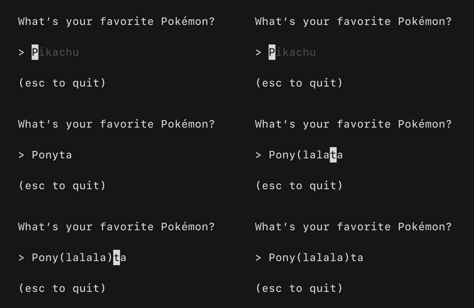
A text input field, akin to an <input type="text"> in HTML. Supports unicode,
pasting, in-place scrolling when the value exceeds the width of the element and
the common, and many customization options.
Progress

A simple, customizable progress meter, with optional animation via Harmonica. Supports solid and gradient fills. The empty and filled runes can be set to whatever you'd like. The percentage readout is customizable and can also be omitted entirely.
Paginator

A component for handling pagination logic and optionally drawing pagination UI. Supports "dot-style" pagination (similar to what you might see on iOS) and numeric page numbering, but you could also just use this component for the logic and visualize pagination however you like.
Viewport

A viewport for vertically scrolling content. Optionally includes standard pager keybindings and mouse wheel support. A high performance mode is available for applications which make use of the alternate screen buffer.
This component is well complemented with Reflow for ANSI-aware indenting and text wrapping.
List
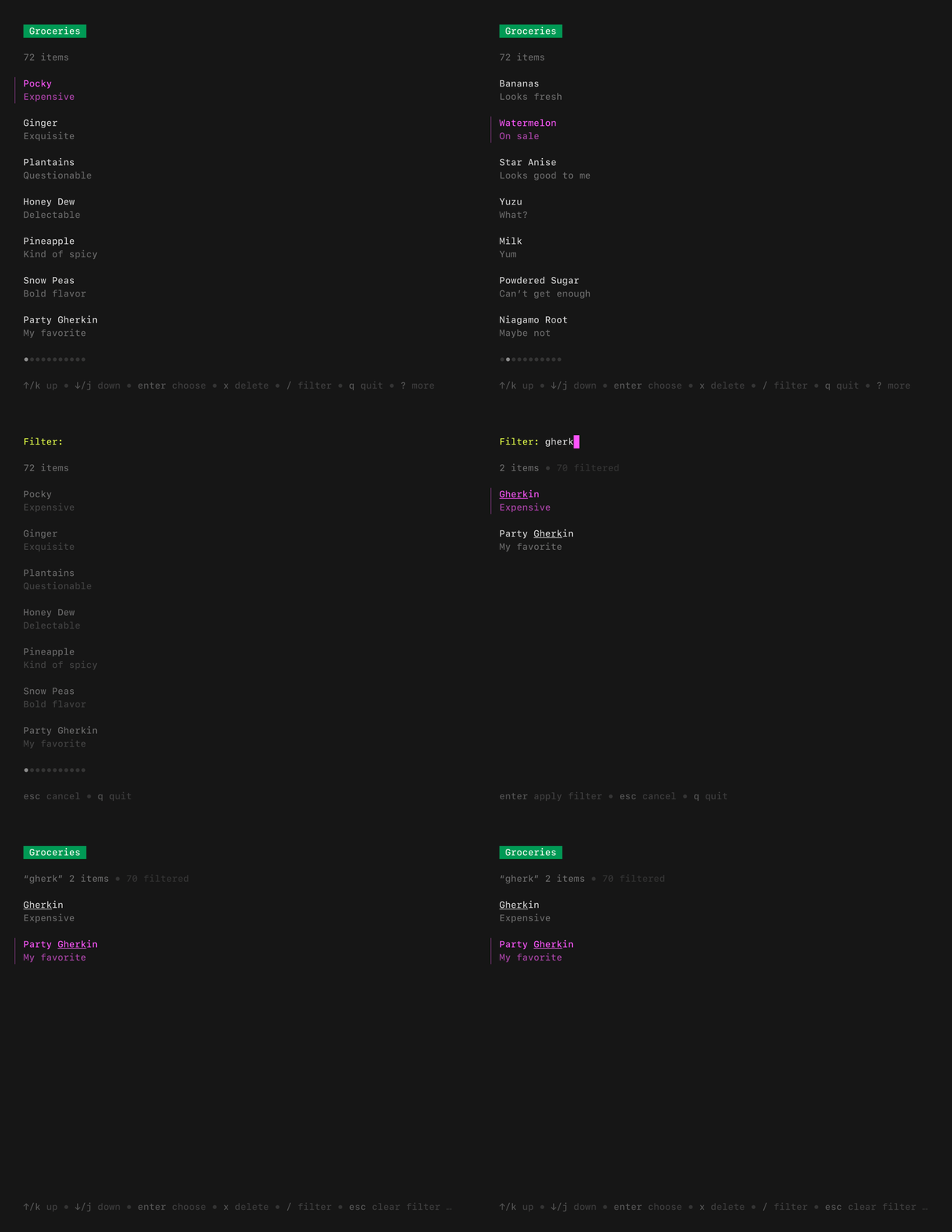
A customizable, batteries-included component for browsing a set of items. Features pagination, fuzzy filtering, auto-generated help, an activity spinner, and status messages, all of which can be enabled and disabled as needed. Extrapolated from Glow.
Timer
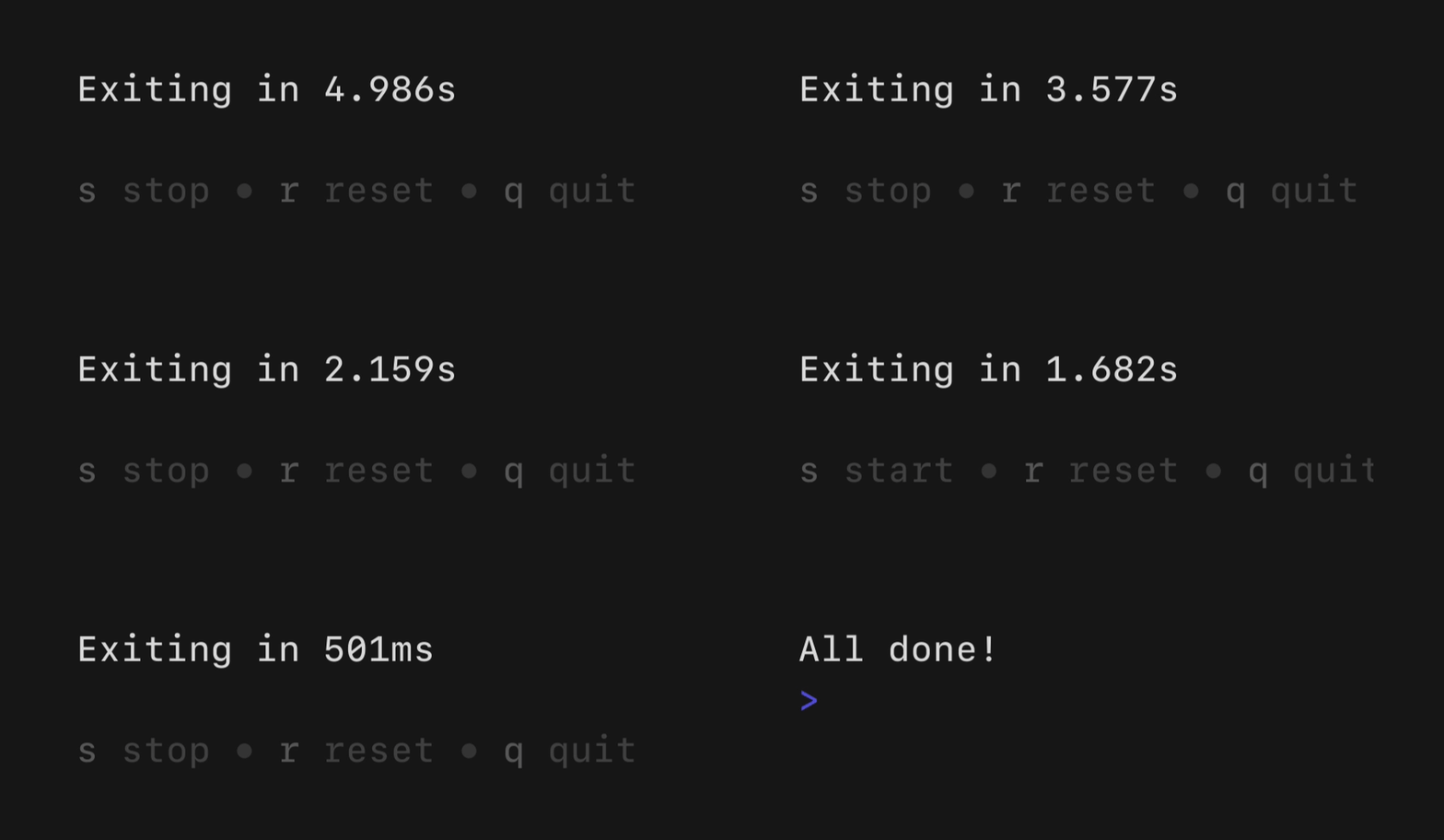
A simple, flexible component for counting down. The update frequency and output can be customized as you like.
Stopwatch
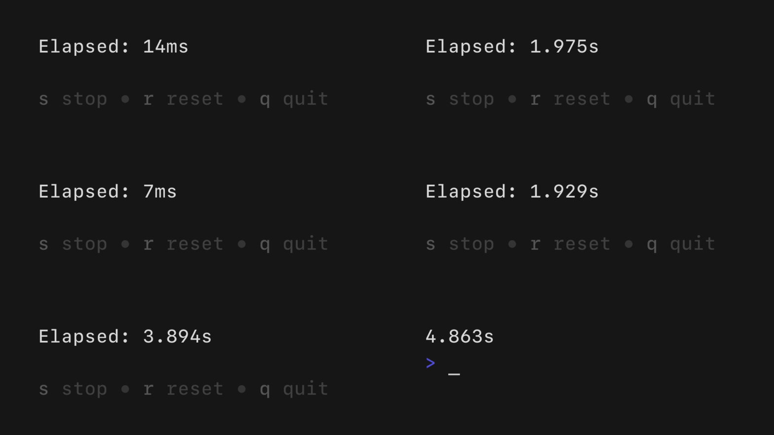
A simple, flexible component for counting up. The update frequency and output can be customized as you see fit.
Help

A customizable horizontal mini help view that automatically generates itself from your keybindings. It features single and multi-line modes, which the user can optionally toggle between. It will truncate gracefully if the terminal is too wide for the content.
Key
A non-visual component for managing keybindings. It’s useful for allowing users to remap keybindings as well as generating help views corresponding to your keybindings.
type KeyMap struct {
    Up key.Binding
    Down key.Binding
}

var DefaultKeyMap = KeyMap{
    Up: key.NewBinding(
        key.WithKeys("k", "up"),        // actual keybindings
        key.WithHelp("↑/k", "move up"), // corresponding help text
    ),
    Down: key.NewBinding(
        key.WithKeys("j", "down"),
        key.WithHelp("↓/j", "move down"),
    ),
}

func (m Model) Update(msg tea.Msg) (tea.Model, tea.Cmd) {
    switch msg := msg.(type) {
    case tea.KeyMsg:
        switch {
        case key.Matches(msg, DefaultKeyMap.Up):
            // The user pressed up
        case key.Matches(msg, DefaultKeyMap.Down):
            // The user pressed down
        }
    }
    return m, nil
}
Additional Bubbles
- 76creates/stickers: Responsive flexbox and table components.
- calyptia/go-bubble-table: An interactive, customizable, scrollable table component.
- erikgeiser/promptkit: A collection of common prompts for cases like selection, text input, and confirmation. Each prompt comes with sensible defaults, remappable keybindings, any many customization options.
- evertras/bubble-table: Interactive, customizable, paginated tables.
- knipferrc/teacup: Various handy bubbles and utilities for building Bubble Tea applications.
- mritd/bubbles: Some general-purpose bubbles. Inputs with validation, menu selection, a modified progressbar, and so on.
- treilik/bubbleboxer: Layout multiple bubbles side-by-side in a layout-tree.
- treilik/bubblelister: An alternate list that is scrollable without pagination and has the ability to contain other bubbles as list items.
If you’ve built a Bubble you think should be listed here, let us know.
License
Part of Charm.
Charm热爱开源 • Charm loves open source

